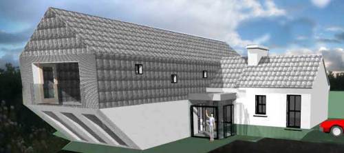
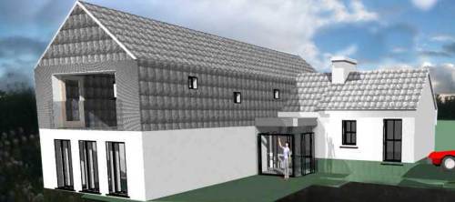
Now here’s an interesting proposal. Below are three designs that extend a very small cottage to make it a 3 bedroom house (the small cottage is on the right hand side of each image).
We’ve gone in for planning and there’s a Further Information request concerning the treatment of one elevation. Bear in mind the following:
* The project is in rural Ireland
* The ground walls are to be limewashed white render with slates on the first floor and roof
* The client requires all spaces to be the right size and not enlarged for the ‘sake of it’
The images below show three alternatives, which one would you pick ?
The results will be taken into next planning meeting and I’ll let you know how we get on…
DESIGN A:

Design A - sloped soffit from first to ground floor
DESIGN B:

Design B - Cantilevered first floor
DESIGN C:

Design C - First floor matches ground floor
For those wanting a bit more site context, below is stitched panorama showing existing cottage and a bit of site:

Existing Cottage in context
Also, below is a section of the site layout plan showing more context & orientation etc… As you can see, the gable in question is facing South-East:

Site Layout Plan showing context/orientation
I am reluctant to vote without seeing the proposals in the context of the site.
Have added an additional site context photo showing existing cottage (bare stonework at moment but will be lime rendered) and the site
If the cantilevered 2nd floor is oriented north or south, you could perhaps make a porch on the ground floor.
Have added a site layout plan for you wavering voters – there may be a Plan D next week !
Scheme C has more square footage than A or B and since I am almost always for reclaiming outdoor space through building massing, B is a clear winner for me.
To me, Scheme C’s straight up end elevation just has a better connection with the cottage’s simple geometry. If you were projecting out over some grade change at the end, I might be convinced of B’s merits.
Voted C- from a design point of view (as well as what I imagine planners would prefer) I think it’s best. Really don’t like A!
I went for C, but I may have opted for B if the eaves detail was more pronounced, like it was in a series of projecting elements.
Just my thoughts.
I prefer C too but it would look better without hung slates on the gable, this may look a bit over bearing, and will give them more emphasis if just on the sides.
I’m a traditionalist by nature – I have to work hard at liking modern design – but while C is the clear winner in terms of what it brings to the resolution of the forms, I can’t help but be intrigued by A and what it might achieve if it was developed.
All of the options need a rethink in terms of materials – a slate roof that size will look terrible. The original cottage looks like a postage stamp trying to hide an elephant.
The “side” elevation with the asymmetrical windows looks very bland and misses an opportunity to get southern aspect light into the new “wing”.
The entrance doesn’t look that convincing, as if the scale is wrong and the ground levels look “fudged” by my reckoning.
Intriguing of the architect to offer if for public review – and brave!